Tone on Tone – That’s Tricky
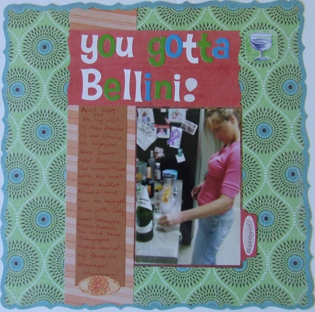
This page highlights a simple, tricky way of sneaking embellishments onto your page. Also you can diminish the busy look of too many patterns on a page using this same trick. It’s called tone on tone. On this page I chose this background paper and started laying out the other elements. I used that peach colored strip to break up that pattern on the mostly green background. Then I placed the title block, the photo and a journaling block atop the peach colored strip. I chose the paper for the journaling block to be purposely darker because it is a bit contrasting from the peach paper, but I placed a sticker at the bottom of the journaling block that nearly matches the peach paper. In fact, it looks as though the journaling block is clipped rather than being cut straight with an oval sticker placed on top. This creates a subtle design element while capping off the journaling too. Then you notice that the journaling block is a bit darker than the peach paper behind it as I said, but they are both basically the same basic color – peach. Then the actual writing is done with a red pen that does not contrast as much as a black or blue pen would on that dark peach paper. This was done purposely so that there is not a visually jarring effect to the writing. If the writing was black (or dark), then it would stand out way too much and call attention to itself which would compete with other elements on the page. This busy background requires a little balance in my opinion so I made the tone on tone journaling block.
There is another little tone on tone trick on the page. Just to the right of the title, but on the mostly green background paper, I placed a sticker. The sticker goes along with the theme of the page in which I picture my sister mixing up bellinis – a favorite drink. The sticker fit right inside one of the circular patterns on the background paper and it really blends in. Notice how you don’t see it on first scan of the page and its elements. This was again done purposely so as not to distract my reader, but to enhance the page. Hopefully you can incorporate some quirky little accents on your pages to delight your readers.
Categorized as: Color Tricks | Layouts | Printed Paper

