Go Overboard!
Sometimes you have a photo that just demands a big, loud layout – one that goes overboard.
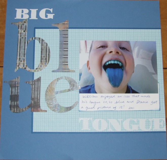
This “Big Blue Tongue” layout was created to complement the one and only photo that could live on this page.
Luckily there are large format alphabet stickers and die cuts to help you make a page like this in no time flat. I let the title do all the talking on this layout and I just love the outcome. I did include a journaling panel beneath the photo, but other than that, this page only contains a couple pieces of blue paper. Talk about BIG IMPACT on a fast page!
Even though there are a lot of large elements on the page, the fact that they are all in the same color family (aside from the neutral white letters) keeps it somewhat under control and not too busy.
Do you have photos of this nature that will require a layout equally as “loud?” Look to your large monogram letters and create whole words with them to see what you come up with.
.
Categorized as: Alphabet | Baby | Color Tricks | Titles

