Photos as Inspiration for Layouts
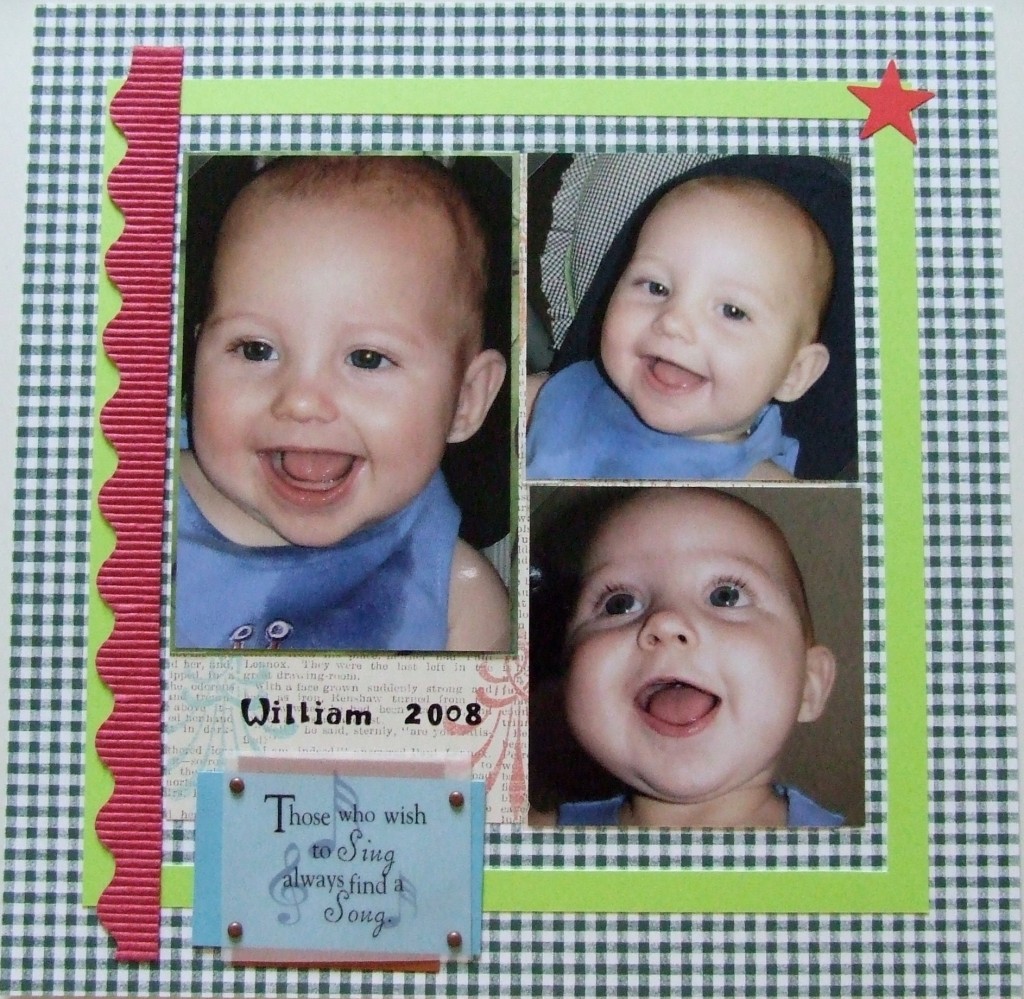
If you ever find yourself at a loss for choosing your papers for a layout for certain pictures, you might be able to use those pictures for inspiration. Here the gingham background paper matches the design on the highchair that the baby is sitting in. There is a pale green piping detail on the highchair which I matched using the pale green frame.
This helped me to break out of the baby boy blue pages that it is easy to be drawn to creating. The baby’s outfit is blue and I did add a small blue scrap beneath the vellum quote, but the page isn’t dominated by blue.
Before I added the red wavy border and the red star, I felt that the page just needed a “pop” color. Every element on the page (including the photos) was too similar in shade (or hue) of the colors. When I added the red on top, it really defined which picture is my main picture out of three that are similarly sized. Plus, the red star balanced the page more spreading the red around a bit. Without that star, the page is just too visually “heavy” on the left.
There really weren’t a lot of special tools used for this page other than the cropadile to make holes for those brads and a star punch. I cut the green frame using a metal ruler, x-acto knife, and self healing cutting mat.
Categorized as: Baby | Embellishments | Layouts | Punches | Templates | Vellum

