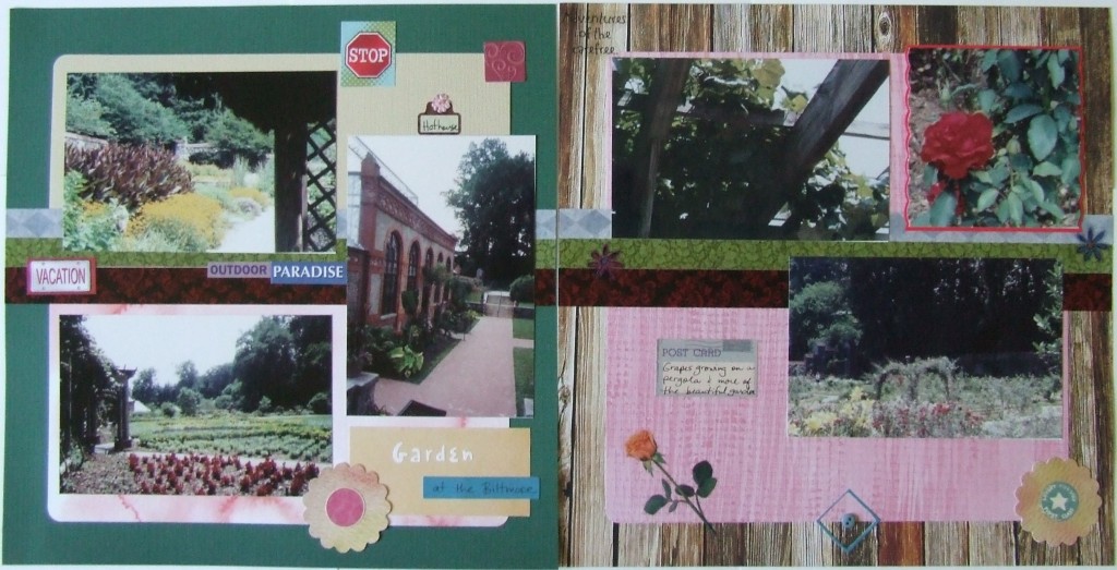
Use Bold Accents to Unite Two Pages in One Layout
 The two pages on this layout were never really meant to go together…before they met me. Ha! I had some wonderful photos of the gardens at the Biltmore but I was piecing together pages because I was at a friend’s house and I was using papers I’d stuck in my bag. I was not going to be stopped by the lack of two matching pages – oh no!
I made pink mats with rounded corners to give the green page and the wood plank page some common ground. Then I had the border stickers that I attached across the center of the pages like stripes – yes stripes, multiple. I used three border stickers to make that big set of stripes really have some presence on the two-page layout. This bold display of matching stickers really unites the pages. Even though I placed photos and embellishments over the top of the stripes, they do go the entire length of both pages and make a cohesive look to the whole layout.
Next, I made some matching flower-like embellishments by using my scalloped circle punch on paper that matched and putting one on each side of the layout. Too (more subtle) I used a small dark pink square sticker placed at the top right corner of the green page to match the placement of the red matted photo on the top right corner of the wood plank page. These little nuances make unmatched paper feel like a true two-page layout.
So get creative when you want to display your photos in a two-page layout but you find yourself without two matching background papers. You can do it with matching embellishments. You can do it with hand-made embellishments. You can do it!
Categorized as: Cost-efficiency | Embellishments | Layouts | Punches | Simple | Stickers
