Outline a Sticker to Make Unique Journaling Block
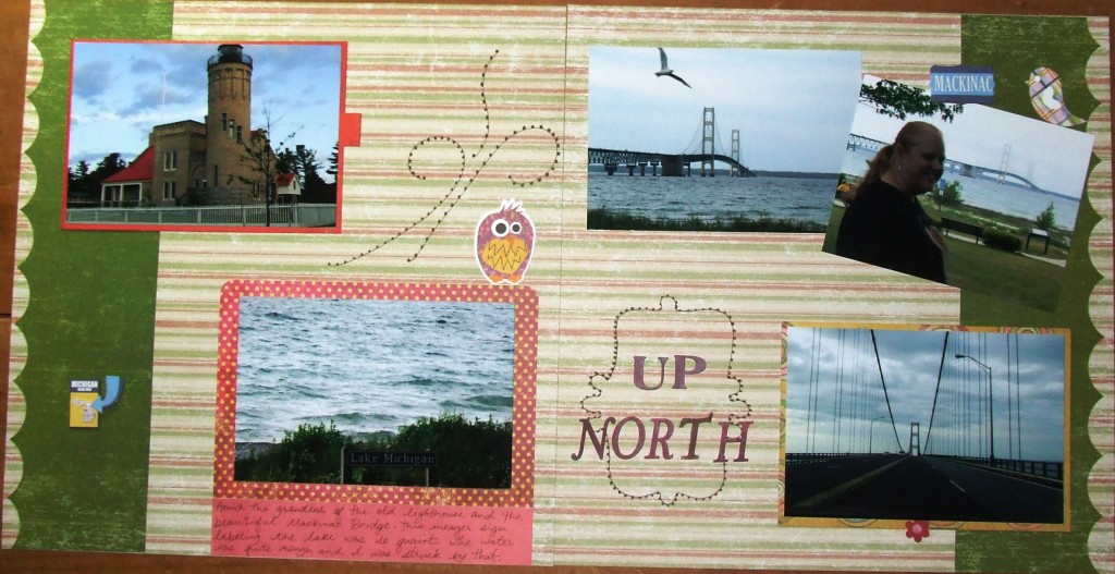
 I was nearing the end of a stack of pictures as I chronicled my trip to Michigan to visit a dear friend when I made this “Up North” page. I had already used the super cute journaling sticker on another layout in the album but I still had the negative on the sticker sheet. So I cut it out and placed it on my page very lightly (so it could be removed in a bit). Then I ran my journaling pen along the inside edge of the sticker to capture the cute shape onto my layout. You could do a pencil for the tracing part and then go over it with your journaling pen if you’re more comfortable with that.
Then I removed the sticker and darkened the line by going over it again with the same journaling pen. Next, I drew little dots along the line to make it look less hand-drawn. I simply placed my title using alphabet letters over the top and I love the outcome! On the opposite page I drew a couple flourishes by hand and then drew the little dots along those lines as well so it matches my sticker outline.
It was very simple to capture the cute shape of the journaling sticker on more than one layout. Plus, since the layouts are in the same album then it adds to the consistency in the album. Notice on this layout that I used VERY few embellishments to achieve a cute, cute look.
This is a great way to stretch your budget and get an album done without having to buy another set of stickers.
Supplies-
Paper: K&Company, Basic Grey
Stickers: Basic Grey, Reminisce Jet Setters
Punch: EKSuccess Whale of a Punch
Pen: Zig Memory System Millennium
Categorized as: Cost-efficiency | Embellishments | Simple | Stickers
