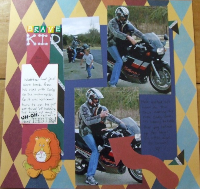
Big Arrow on Top of Photo
Sometimes there is something on your photo that you want to point out without actually cropping away the rest of the photo. This is a good time to use a big arrow die cut embellishment.
It is an easy way to draw attention to something in a photograph, spread color around your layout and stack elements to get more of them on the page.
By placing the arrow directly atop the photograph it is easy for the reader to see what you are exactly referring to in your subject or journaling. Plus die cuts like this come in practically any size, color and shape (curving in a circular pattern, straight, with a wavy line, etc.)… especially if you make it yourself.
It’s easy to use big embellishments like this without requiring a lot of space on your layout for the arrow itself because it is going right on top of the area designated for the photo with perhaps only a little bit of overlap.
On this “brave kid” layout, I used the arrow to point out a little tyke on the motorcycle as well as place some of that deep red-orange color that matches the dark red diamonds on the background paper as well as the orange hues in the lion sticker embellishing the lower left-hand side of the layout.
I think it was a great accompaniment as well as a tool for pointing out my nephew.
.
Categorized as: Color Tricks | Embellishments

