Stickers Don’t Have to be Stuck in the Center of Your Page
If you’re placing stickers on your page only where there is open space, then you might be interested to learn that there is another way. Put down your stickers, sticker machines and rub-ons and pay attention.
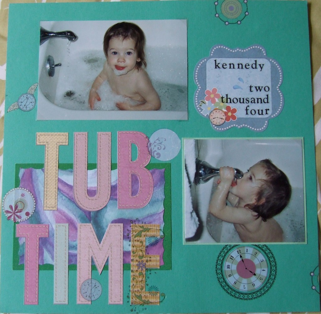
Stickers going over the edge of the page appear to give the page more depth and dimension. On this page I used clock rub-ons to fit the “time” theme; as a bonus since they are round, the clocks are supposed to simulate bath bubbles which also goes along with the theme.
Notice how these clocks and other circles overlap elements like the colored box behind the title, the letters in the title and even the pictures. Some of these so-called bubbles go over the edge of an item while others go under the edge they are beside. Then on the edge of the background paper itself, I made a circle go right off the page. This is easy to achieve and once you cut off the portion that won’t be on the page you have another portion to place on another edge somewhere.
Another thing I did with one of the clock stickers is to place it right atop a flower image on the journaling piece. This is a simple way to tie in the rest of the page with that piece when it did not necessarily come together as part of a kit or a like design.
Also, I didn’t use an expensive piece of patterned paper here opting for cardstock instead. Cardstock can be bought in bulk for a cheaper price than individual sheets and with something as easy as stickers or rub-ons to decorate it, why not opt for this less costly choice?
Categorized as: Baby | Cost-efficiency | Embellishments | Stickers

