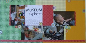
Drop Shadow on Title Lettering
So I had made this page and added the white journaling area and knew I wanted to put my title there. When I started playing around with letter placement and discovered this really neat looking effect by accident, I knew I was going to have to show others. Basically, I layered alphabet stickers to get a shadow effect. These stickers were part of the same sheet and there were both black and green letters – the bonus is that they were exactly the same font. That’s the key to making this work. I liked the black or the green letters, but when I put them together I saw the combination. When I saw how it looked, and how it made my eye stop and look at it, then I knew it was exactly what this page needed for that white block.
Labels/Tags: titles, embellishments, alphabet stickers
Categorized as: Embellishments | Stickers | Titles


