Incorporating Neon Colors
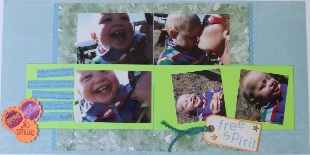
Using neon colors can be intimidating. How do you find a nice balance on your layout? The pop of color from neon colors is dramatic and can be overbearing. So how do you complement the neons with other colors? On this “free spirit” layout I used the bright green as a color block, the bright orange as an embellishment and the bright teal rickrack as another embellishment. These colors are so strong that they might feel overwhelming on the page if I didn’t have the muted background. Notice too that the muted colors make up the majority of the design; I’d say about two thirds of this layout is made up of muted colors while the neon colors make up just one third. You might think that pairing the neon colors with black or white would be best but I find those two colors to be just as powerful (and sometimes harsh) as the neons themselves. For this reason I think it’s best to find some washed out colors to place next to neon colors. Notice how the neon elements are truly highlighted. They really do pop right off the page as bold but not overwhelming. I chose to do a mostly monochromatic design here. That bright green color block is bright but not so different from the other blues and greens in the background since they are all part of the same or adjacent colors on the color wheel. Your eye goes directly to the bright orange embellishment on the left side of my layout and then reads across to the right side where the title tag sits. So next time you find some old neon paper or embellishments in your stash of supplies, give them a try!
Categorized as: Baby | Color Tricks | Embellishments | Layouts | Simple

