Primary Colors are Dependable
 Primary colors go together with almost any variation of the three colors: red, yellow and blue. If you’re in a quandary for colors on a page you’re contemplating, then primary colors can get you out of a creative rut and get you going on creating the page.
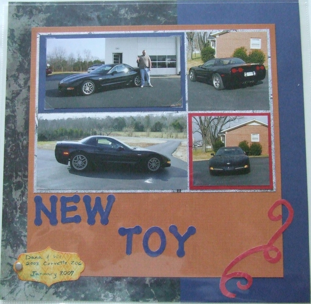
This “new toy” layout features my husband with a new car he’d gotten. It was wintertime so my trees had no leaves and the grass was brown so the photos really did not give me a lot of direction with color…especially since the car was black. I could have gone with a black and white layout but I think the car would have been lost amongst other black elements since there is so much blacktop showing in the photos as well. I chose basic primary colors as a palette for showcasing these photos.
Notice too that the photos are matted multiple times. There are four photos that all sit on a concrete grey mat and then two of those photos are matted with the primary colors. All the photos and the title are matted together with a burnt orange/brown mat that matches the bricks on the house in the photos. These multiple mats draw your attention and inject color onto the layout to tie the color scheme together.
Next time you’re having trouble choosing a color scheme for your layout, then try going with primary colors and see if they work for you…..I bet they will! Try matting a couple photos and throwing a couple elements on a page all using the primary color scheme and watch your layout come together fast! This is a great way to use up some of those extra embellishments from your kits too – do you have any extra pieces lying around waiting to spiff up your layouts?
Categorized as: Color Tricks | Cost-efficiency | Embellishments | Layouts
