Quadrants
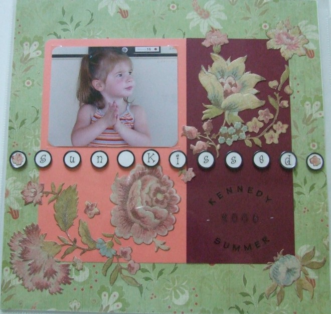
Sometimes when I’m creating a page. I use the design concept of quadrants. This means that I divide the page into four sections visually. Here you can see that I have done this on this page. It’s somewhat subtle sometimes but on this page with the use of the different papers and the circle embellishments across the center, it’s much more obvious.
Another tip I can offer is using the whole sheet of stickers. I bought these beautiful flower stickers before I ever knew what I would use them on. Then when I began laying out this page they just made sense. I used the maroon as the darkest color which “grounds” the page visually since everything else is quite light. Then the salmon colored paper was chosen to match the shirt in the picture as well as complement the green background paper. Once I started laying out the stickers I knew I needed a really great title. I wanted something to go all the way across the page and I had these tag stickers which fit all the way across and the small alphabet stickers fit right on them. I laid my ruler right on the page to be sure to space them out evenly and then I stuck them on the page. I love how they came out and they really “pop!”
As far as using ALL those flower stickers, I just started laying them out and it seemed like a lot at first and then I realized I was only going to leave a couple on the sheet un-used. And I thought, “what will I do with these in the future?” Then I decided to fit them all on the page and I loved the outcome! Now I try to use whole sheets of stickers like leaves, flowers, bugs, butterflies, and so on.
Finishing out the quadrants was easy once I had the photo in one corner and the title across the middle. I knew I needed to put some journaling on there so that went in the quadrant opposite (catty corner) the photo. That left the other two quadrants which I filled with the flowers. Notice how the flowers go over the maroon and salmon paper onto the green background. This softens those hard edges a little bit and gives the page a bit of “movement” visually. That way your eye moves all around the page, but it does stop to see each of the elements I purposely placed.
Categorized as: Embellishments | Layouts | Scrapbook | Sunshine | Titles | Toddler

