Convey a Feeling From a Simple Photo
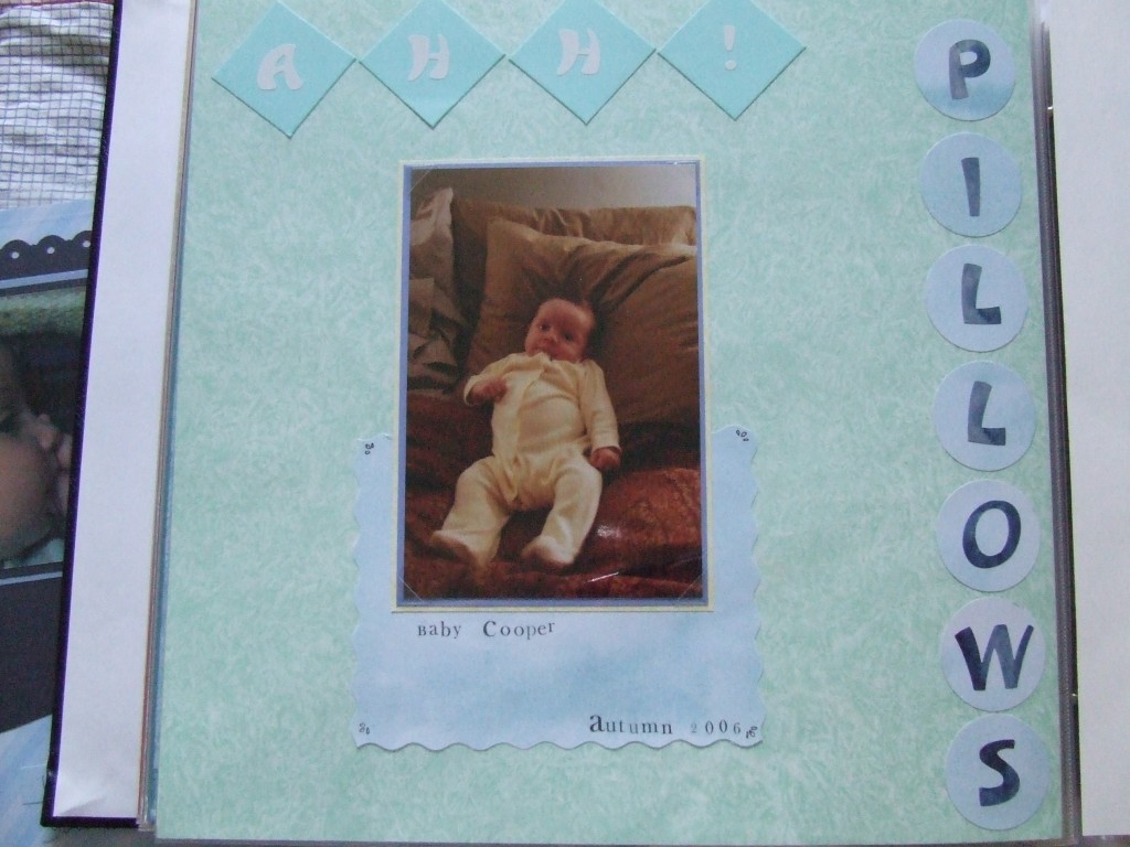
Do you ever find you have a photo you want to scrapbook, but it’s kind of plain and therefore difficult to figure out what to focus on for the design of the page? I felt this way about this photo, but it was one of only a few I had of my newest cousin, so I really wanted to scrapbook it. As I looked at the photo I just thought it sure looks comfy on all those pillows. So that’s where I decided to focus my attention for the page.
I needed elements for the page and I didn’t have any pillow embellishments. I had to get a bit creative by placing the alphabet stickers on the die cuts to use some of the space up. I also double matted the photo but there was still so much blank area on the page that I felt needed to be used. So I thought about adding another mat with a 1- or 2-inch reveal, but then I saw this scrap and I was playing with placement. I loved how the muddled, muted design fit well with that of the background paper. They are also very baby-like, so good for my page. Anyway, I got the idea to place it under the picture even though it was not a large enough scrap to be a true mat. Then I thought, “that looks like a pillow for the photo” so I went with it. I think it’s quite subtle, but a nice touch on an otherwise plain page. I was sure to add rub-ons to the four corners of that photo “pillow” so that attention is drawn to it. I don’t know that people who look at the page will really recognize that was my intention, but I like it and I think it looks good.

