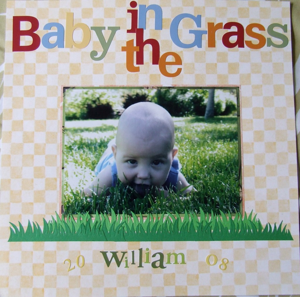
Squeeze a Title into Place
Sometimes you just can’t fit your title in the space where you want it. This is a quick and easy way to accomplish fitting your title right where you want it. I was using these wonderful cardstock alphabet stickers and I refused to choose not to use them because I just loved them for this baby page. Here’s how you can get the letters in the space without going over the edge. First I placed the “B” in Baby and then I placed the last “S” in Grass. Notice how my paper has a check pattern? That made it easy to line the letters up. So next I started placing the a, b and y in “baby” and the s, a, r, and g in “Grass” and in that order. The order in which you place the letters is important because you want to be as efficient as possible with the limited space you’re working with. Once I finished placing Baby and Grass, then it was time to fit in those two small words “in the” which wouldn’t fit in a straight line. So I just played with laying them out until I fit them into place. I also overlapped those letters in the middle but not the ones in the outer words; this lends itself to the illusion of the cramped letters actually running into one another. So don’t give up easily if your title letters won’t fit exactly where you were thinking you would like to place them. Play with them a bit by trying to fit them in – you might surprise yourself with a cute arrangement.
Categorized as: Baby | Layouts | Stickers | Titles

