White Journaling Blocks & Hand-Drawn Columns
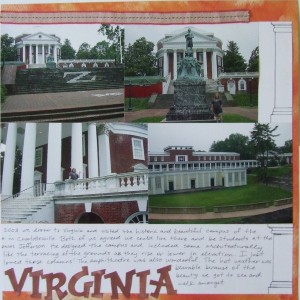
 I filled up these pages with photos of buildings at the University of Virginia but then I found myself with two dilemmas – the need for some journaling space and how to evenly display those photos. The pages themselves were quite dark because I used the school colors (or as close as I could get) so I just made a big, white journaling area to complete the rectangle created by the photos (notice how the photos don’t line up perfectly to make that rectangle).
You might recognize this basic layout idea as it is one I got from Scrapbooks, Etc. (my beloved magazine). I started with this layout idea with the round title block and just started filling in the page with my photos. Once I decided to put the white on the layout as the journaling block and to complete the rectangle of photos – I felt like it needed just a little something. So I drew some columns on the right-hand side to match the columns in all those photos.
You can draw columns easily too – they are straight lines; just get your ruler, be patient and start with pencil! Go back and cover the pencil with your journaling pen (again using your ruler) and no one will be the wiser! Talk about a cheap embellishment!
The white journaling area really becomes a bold feature on this layout because of the dark background paper, brilliantly colored photographs and the deep-hued lettering across the bottom of the page. It works too I think because all those columns in all those photos are white. Do you have photos with white as an accent in them? Try using dark background paper with a white journaling block and keep it crisp for the contrast by not inking the edges.
Categorized as: Color Tricks | Cost-efficiency | Embellishments | Journaling | Layouts | Simple

