Inspiration from Photos for Elements on Page
If you have a single photo and don’t really know where to go with it especially on a large 12×12 page, then you might find some inspiration within the photo itself.
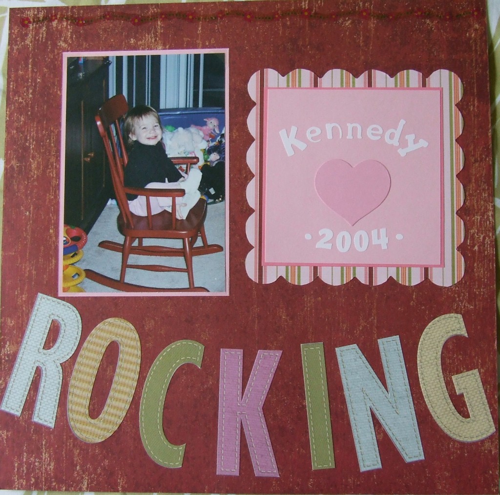
In this layout I used the maroon colored paper to match the rocking chair and the pink elements to match the little girl’s pants. Then I chose huge letters so they would take up a lot of space on the page. I arranged them in an arc similar to the runners on the rocking chair. This did two things: used up even more space than the letters lined up straight and tied the title to the picture.
Notice how the bent title gives the page “movement” by making you think about that chair rocking. Of course there is no actual movement, but it’s easy to imagine the little girl actually rocking!
To soften the pink block of paper, I matted it and placed it atop a scalloped edge square.
Talk about a fast page that didn’t cost much because there are really no expensive embellishments and the page is so cute without them!
Categorized as: Cost-efficiency | Embellishments | Layouts | Titles

