Make a Skinny Photo Fat With a Dark-Colored Mat
Have you ever laid out your pictures and envisioned the perfect way to place them all on the page only to realize that one or two just won’t work? I have a solution that just might work on your page!
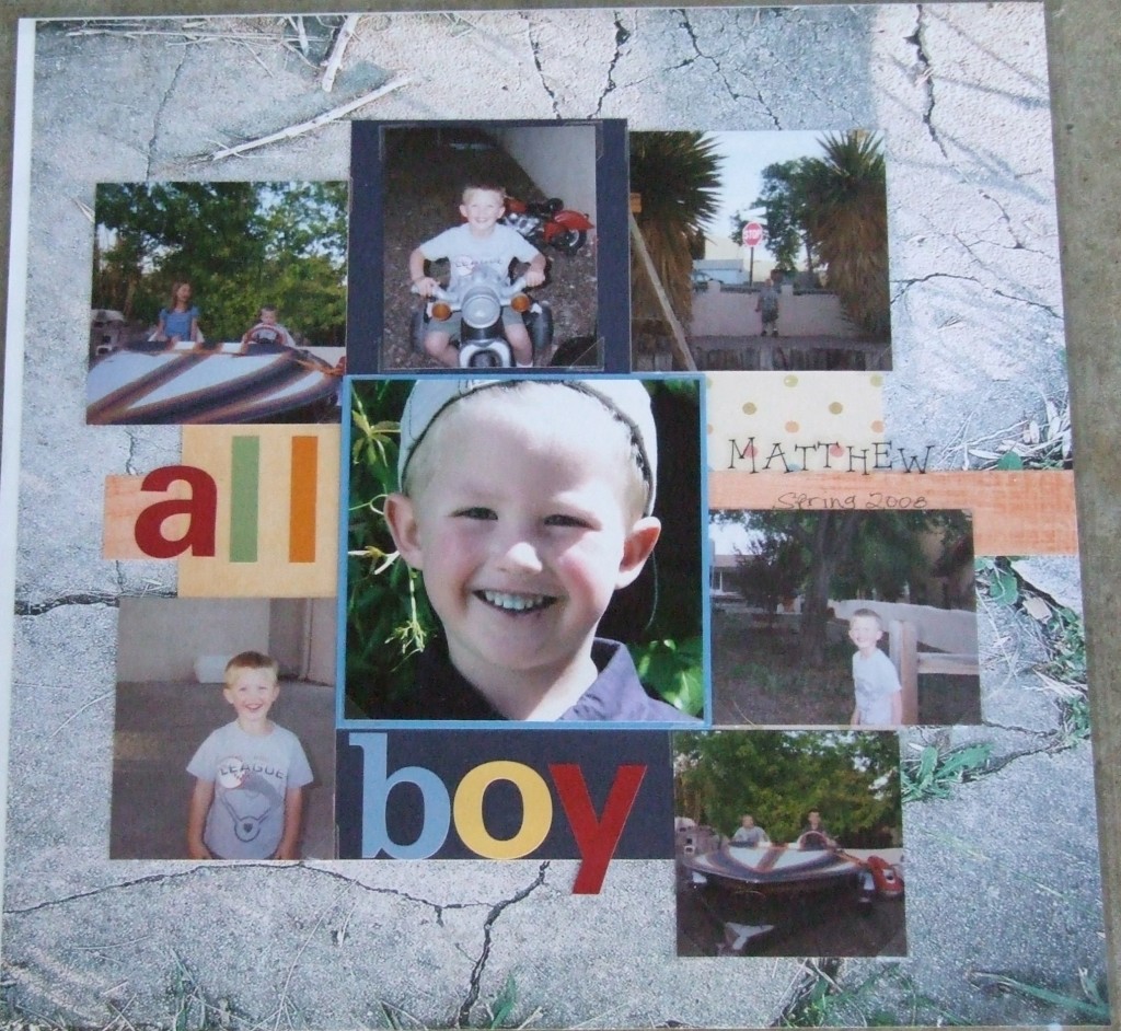
This page was working great but the top row of photos wouldn’t line up quite right. One photo was too skinny to fill the void between the outer two photos on that row. But when I placed that narrow photo atop a navy blue paper mat it fit perfectly!
The dark paper mat recedes from the eye because it is dark. This means that when you look at it those spaces between the photos don’t jump out at you as spaces because they’re filled with the dark paper. Rather they blend into the photos directly on either side and make it seem like they are all butted against one another.
The navy paper appears to continue beneath the center photo but it if you look closely you see that the right edge of that block is actually not lined up with the navy block above the center photo. This is because the letters to spell “boy” would have gone over the edge of that paper. I simply made the block slightly wider to accommodate the lettering and it really does appear blend well.
Using color to trick the eye is a simple way to make certain elements of your page stand out while at the same time masking other elements.
Categorized as: Color Tricks | Embellishments | Layouts | Simple

