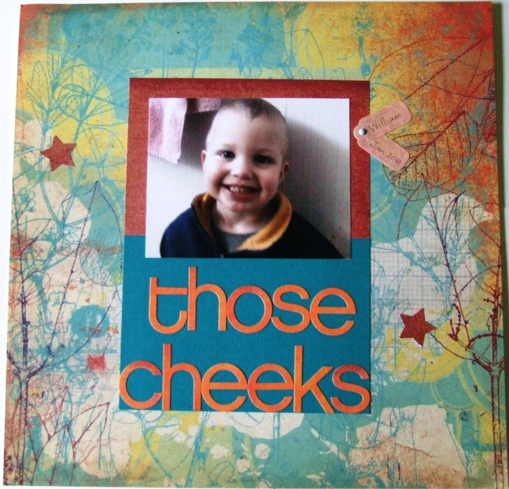
Matting a Photo and Title Together
Talk about easy! If you need a quick way to make your photo take up a bit more space on the page, then look to your mats. Here I had a photo that was taken in a landscape orientation as opposed to portrait orientation. I had printed the photo before I could alter it electronically, so I improvised by trimming the useless parts of the photo off. The photo was even smaller then so I combined the title and the photo together to be matted. Then to make the mat more interesting I used two colors to make the one mat. This keeps the mat from becoming a huge cumbersome chunk on the page. The title letters I chose are a similar color to the part of the mat that is not beneath the letters. Then I made sure the maroon colored mat section did not completely mat the photo – notice how the maroon color does not completely surround the photo. I butted the green part of the mat against the maroon part and trimmed so that the title lettering would fit on the bottom. So if you have a picture that pretty much says it all – think about combining your picture with your title and matting them as one cohesive unit.
Categorized as: Baby | Layouts | Simple | Titles

